
Navigation
Install the app
How to install the app on iOS
Follow along with the video below to see how to install our site as a web app on your home screen.
Note: This feature may not be available in some browsers.
More options
You are using an out of date browser. It may not display this or other websites correctly.
You should upgrade or use an alternative browser.
You should upgrade or use an alternative browser.
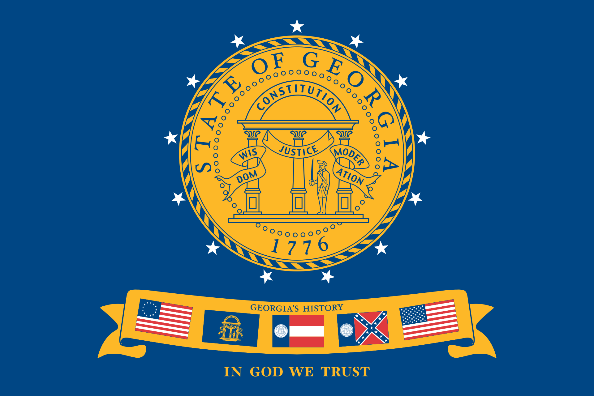
Mississippi’s New Flag
- Thread starter Grant
- Start date
- Status
- Not open for further replies.


BoundByTheScriptures
Puritan Board Freshman
Can we talk about how they went about it?
Legislature suspended the rules to change it. Governor came in on a Sunday to pass the resolution. They setup a committee whose rules forbid having the old flag, and then they refused to put the old flag on the ballot.
All of this because the last time there was a ballot initiative to choose the old or new flag, the old flag passed with like 70% approval. This time they removed the option of keeping the old flag.
Sorry, when I look at it, I see nothing but corruption and soft totalitarianism.
Last edited:
BoundByTheScriptures
Puritan Board Freshman
So, you probably wanted to ask about the In God We Trust on the flag? Within a day of getting the new flag, they are already talking about replacing it for the same reason they replaced the previous flag, "it's too divisive":
SeanPatrickCornell
Puritan Board Junior
Looks good.
Grant
Puritan Board Graduate
David,
What's done is done. Wile I may share some of your sentiments, the OP image is the new flag. Overall I think it is a beautiful flag. I go back and forth on God's name being on it. I am also wrestling with a thought to have one in my front yard or not. I would not have thought or wanted to have the confederate emblem in my yard, not because I dislike it, but because it may have been a stumbling block to others and it is certainly not a requirement to have a state flag in ones yard no worth causing offense or division over.
What's done is done. Wile I may share some of your sentiments, the OP image is the new flag. Overall I think it is a beautiful flag. I go back and forth on God's name being on it. I am also wrestling with a thought to have one in my front yard or not. I would not have thought or wanted to have the confederate emblem in my yard, not because I dislike it, but because it may have been a stumbling block to others and it is certainly not a requirement to have a state flag in ones yard no worth causing offense or division over.
Grant
Puritan Board Graduate
BTW, the new flag was approved 70% Yes - 30% No.

 www.wapt.com
Mississippi general election results: November 2020
Mississippi voters cast their ballots Nov. 3 in the general election.
www.wapt.com
Grant
Puritan Board Graduate
I think based on the state being majority protestant it is the only God worthy of a "G". But you have a god point. If I were to place in my yard, it would certainly be the "G"od. I also think that generally where I live we used the title God for the one in the Bible. Also a possible sign was that when the legislature decided to strike down our old flag, they consulted with several protestant ministers & groups.In which "God" does the legislature purport that the people of Mississippi trust?
Last edited:
Jack K
Puritan Board Doctor
Regardless of the message, no one should put tiny writing on a flag—or tiny details of any kind, for that matter. The elements on a flag should be recognizable and readable from a distance while the flag is fluttering, or recognizable when the flag is used as a tiny icon in printed materials or online.
The magnolia is an excellent idea, something fitting for Mississippi and distinctive, and presumably something widely appreciated by all the state's residents. This particular magnolia is a bit too detailed, since a flag should be simple enough that a seven-year-old could draw it and come reasonably close. But that's a small complaint compared to the tiny lettering issue, which seems designed to make a political-social-religious point rather than to make a great flag.
I'm guessing all the unnecessary stars have some supposed meaning, too, I suspect someone tried to incorporate a few too many ideas into the flag. Simpler is usually best: one iconic symbol that fits the state.
The magnolia alone, perhaps with some of the stripes, would have made an elegant, instantly distinctive, and proud flag.
C. M. Sheffield
Puritan Board Graduate
@Jack K, I agree with your points on design. Many flags designed today are marred by these design flaws. I would add, the yellow and red vertical stripes are unnecessary and make it look more like a corporate logo banner than a state flag.Regardless of the message, no one should put tiny writing on a flag—or tiny details of any kind, for that matter. The elements on a flag should be recognizable and readable from a distance while the flag is fluttering, or recognizable when the flag is used as a tiny icon in printed materials or online.
The magnolia is an excellent idea, something fitting for Mississippi and distinctive, and presumably something widely appreciated by all the state's residents. This particular magnolia is a bit too detailed, since a flag should be simple enough that a seven-year-old could draw it and come reasonably close. But that's a small complaint compared to the tiny lettering issue, which seems designed to make a political-social-religious point rather than to make a great flag.
I'm guessing all the unnecessary stars have some supposed meaning, too, I suspect someone tried to incorporate a few too many ideas into the flag. Simpler is usually best: one iconic symbol that fits the state.
The magnolia alone, perhaps with some of the stripes, would have made an elegant, instantly distinctive, and proud flag.
Regardless of anyone's opinion's about Confederate symbols, the old Mississippi flag was clearly superior from a vexillological standpoint. It looks like the banner befitting a great state. The new flag looks like a logo for a chain of hotels. One is a banner worthy of the state's militia to carry into combat; the other looks more like a banner for the Mississippi Tourism Association.
Of course, the old flag isn't going away. People who love their state and are proud of its history will continue flying it.
Reformed Covenanter
Cancelled Commissioner
I think that it is a pretty nice flag. It reminds me of some of the military flags that we have over here.
Grant
Puritan Board Graduate
Pastor,Of course, the old flag isn't going away. People who love their state and are proud of its history will continue flying it.
It is certainly not wise to infer that every person who does not fly a flag is ashamed or hateful towards their state/history. I think it is also helpful to remember that a Magnolia Flag predates the previous Mississippi Flag w/ confederate emblem. It is also important to understand that we have had racism in our state and it is still alive in the hearts of men and women of all colors today. I do respect your opinion on design. Bear in mind that the legislature did establish design restrictions such as: "must include In God We Trust" and "cannot have a confederate emblem". I am not defending the decision, but trying to state some facts is all.
Grant
Puritan Board Graduate
These are good thoughts Jack. One of my good friends likes the flag, but also wished it were just a little simpler. Do you like the Colorado State flag? To me it is simpler, but for some reason Colorado's flags reminds me of the Chicago Cubs and not the State.Regardless of the message, no one should put tiny writing on a flag—or tiny details of any kind, for that matter. The elements on a flag should be recognizable and readable from a distance while the flag is fluttering, or recognizable when the flag is used as a tiny icon in printed materials or online.
The magnolia is an excellent idea, something fitting for Mississippi and distinctive, and presumably something widely appreciated by all the state's residents. This particular magnolia is a bit too detailed, since a flag should be simple enough that a seven-year-old could draw it and come reasonably close. But that's a small complaint compared to the tiny lettering issue, which seems designed to make a political-social-religious point rather than to make a great flag.
I'm guessing all the unnecessary stars have some supposed meaning, too, I suspect someone tried to incorporate a few too many ideas into the flag. Simpler is usually best: one iconic symbol that fits the state.
The magnolia alone, perhaps with some of the stripes, would have made an elegant, instantly distinctive, and proud flag.
C. M. Sheffield
Puritan Board Graduate
Georgia is perhaps a rare example of a state changing its flag for the better. Again, from a purely vexillological standpoint, Georgia's current flag is superior to the 1956 flag; and vastly superior to the 2001 design (a.k.a. "Roy's Rag").
1956 Flag:

The flag imposed on the people by Gov. Roy Barnes in 2001. This flag is what you get when you take all of the long-established principles of good flag design and do the exact opposite:
The current flag:

As a Georgia native, I am very pleased this was the end result.
1956 Flag:
The flag imposed on the people by Gov. Roy Barnes in 2001. This flag is what you get when you take all of the long-established principles of good flag design and do the exact opposite:
The current flag:
As a Georgia native, I am very pleased this was the end result.
Last edited:
C. M. Sheffield
Puritan Board Graduate
I assume no such thing. I only assume that people who still fly the old flag do so because they love their state and are proud of its history.Pastor,
It is certainly not wise to assume that every person who does not fly a flag is ashamed or hateful towards their state/history.
C. M. Sheffield
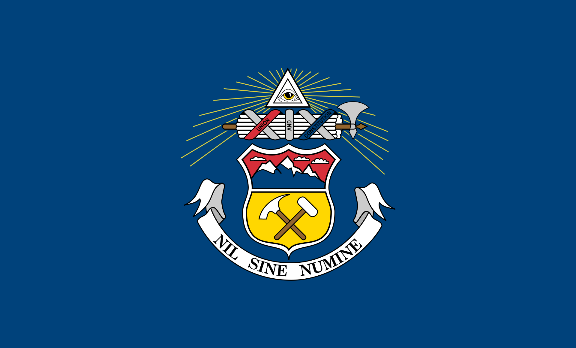
Puritan Board Graduate
A state flag must be simple. But it must also be stately. The flag of Colorado succeeds at former but fails at the latter. It looks like a banner for a sports team.One of my good friends likes the flag, but also wished it were just a little simpler. Do you like the Colorado State flag? To me it is simpler, but for some reason Colorado's flags reminds me of the Chicago Cubs and not the State.

Their original flag was not as simple, but still much more stately and, I think, superior in design:
Grant
Puritan Board Graduate
I agree. But I also think that given all the circumstances, MS did pretty well. The 2d runner up, I also liked but I think it looked more like a sports emblem as well:A state flag must be simple. But it must also be stately. The flag of Colorado succeeds at former but fails at the latter. It looks like a banner for a sports team.

Grant
Puritan Board Graduate
A state flag must be simple. But it must also be stately. The flag of Colorado succeeds at former but fails at the latter. It looks like a banner for
Now that you post an image of the Colorado flag it looks like Pac-Man got sunburn.


hammondjones
Puritan Board Junior
I'm just going to leave this one here....

ZackF
Puritan Board Professor
Gilligan's Island?
Jack K
Puritan Board Doctor
I agree with the bulk of the comments here. The Colorado flag is admirable in its simplicity, but lacking in what it evokes. Colorado has great symbols: mountains, elk, snow, etc. Why would you want to use a letter of the alphabet?Do you like the Colorado State flag? To me it is simpler, but for some reason Colorado's flags reminds me of the Chicago Cubs and not the State.
The flag of the city of Denver is much better.

C. M. Sheffield
Puritan Board Graduate
South Carolina's flag is perhaps the single best state flag of the fifty, in my humble opinion.
SeanPatrickCornell
Puritan Board Junior
The Arizona State Flag is if not the best flag in the Union, at least in the top five.

Jack K
Puritan Board Doctor
Most US state flags are lousy. They feature state seals, lettering, or tiny pictures, and often look pretty much like any other state flag. I can't come up with even ten of them that are actually good. Based on being simple, distinctive, and evocative, creating a proud state banner that's widely used, my top seven list, in order, is:
1. New Mexico
2. South Carolina
3. Texas
4. Arizona
5. Alaska
6. Alabama
7. Tennessee
In many cases, you may know what these states' flags look like without needing to have the pictures posted, which is one test of a flag that works. They've become a true symbol for that state.
1. New Mexico
2. South Carolina
3. Texas
4. Arizona
5. Alaska
6. Alabama
7. Tennessee
In many cases, you may know what these states' flags look like without needing to have the pictures posted, which is one test of a flag that works. They've become a true symbol for that state.
SeanPatrickCornell
Puritan Board Junior
My problem with the flag of South Carolina is that it looks like it could be the flag of any Islamic nation in Arabia or Africa.
Jack K
Puritan Board Doctor
Here is the flag of New Mexico, my childhood home, for those who don't already know what it looks like. It both evokes sunshine and is a nod to the state's Native American heritage, being derived from a presumed-to-be-sacred symbol of one of the state's smaller pueblos. That occasionally causes a few complaints ("Why do we have a pagan symbol on our flag?" or more often these days "How dare you appropriate a sacred Native symbol for your use!"), but I doubt the flag will be changing anytime soon.
If you venture into New Mexico, you see the symbol everywhere. Most New Mexicans love their flag. There's even a state-flag pledge of allegiance that gets recited in some schools. And most actual Native Americans in New Mexico aren't bothered by cultural appropriation (which tends to be brought up by liberally-educated whites who are angry on the Native Americans' behalf), but rather are happy to have Native heritage represented.

If you venture into New Mexico, you see the symbol everywhere. Most New Mexicans love their flag. There's even a state-flag pledge of allegiance that gets recited in some schools. And most actual Native Americans in New Mexico aren't bothered by cultural appropriation (which tends to be brought up by liberally-educated whites who are angry on the Native Americans' behalf), but rather are happy to have Native heritage represented.
Confederate Flag gone today, voting Democrat tomorrow. Just look at my Georgia right now. We removed our heritage from our flag back when I was in elementary school. Now, less than two decades later, our state is on the cusp of giving 16 electoral votes to a baby-slaughtering communist.
Charles Johnson
Puritan Board Junior
Maryland is on the phone and would like to speak to you.Most US state flags are lousy. They feature state seals, lettering, or tiny pictures, and often look pretty much like any other state flag. I can't come up with even ten of them that are actually good. Based on being simple, distinctive, and evocative, creating a proud state banner that's widely used, my top seven list, in order, is:
1. New Mexico
2. South Carolina
3. Texas
4. Arizona
5. Alaska
6. Alabama
7. Tennessee
In many cases, you may know what these states' flags look like without needing to have the pictures posted, which is one test of a flag that works. They've become a true symbol for that state.
Jack K
Puritan Board Doctor
Maryland would have to be included if the list expanded to ten. It's distinctive and historical, but awfully busy. It fails my "seven-year-old could draw it" test.Maryland is on the phone and would like to speak to you.
- Status
- Not open for further replies.
Similar threads
- Replies
- 7
- Views
- 929
- Replies
- 62
- Views
- 4K